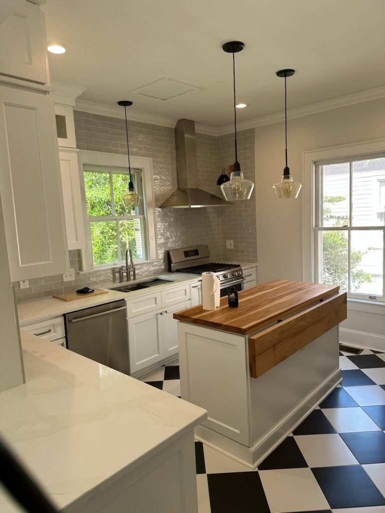
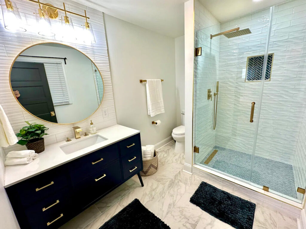
The Home Revive is a one-stop for all home renovation needs. Proudly serving Alamance and surrounding counties, they specialize in revitalizing kitchens, bathrooms, decks, and floors with a blend of expertise and creativity.
The Home Revive was created as a new business to serve a broader audience beyond the scope of its sister company, Out With The Mold, which focuses exclusively on mold remediation. As they expanded into home renovations and larger-scale projects, it became clear that this new offering didn’t align with the original business model, prompting the need for a distinct brand identity.
When I began working with them, The Home Revive was a blank slate—just a name with no established identity or online presence. To successfully launch, the brand needed to communicate trust and professionalism while appealing to homeowners tackling renovation projects that exceed the typical DIY scope. Additionally, the identity needed to reflect their mission of energizing spaces within a reasonable budget, with values rooted in fairness, reliability, and a deep understanding of client needs.
The Vision
The Vision
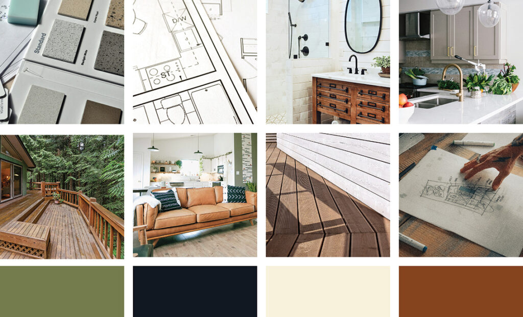
The goal of this project was to create a design that balanced high contrast for an elegant and professional feel, with an earthy color palette to add warmth and grounding. High contrast was achieved through the intentional use of typography, particularly the bold and refined primary font, as well as the interplay of colors like pale tan, dark charcoal, and mid-tone olive green. These elements worked together to establish a polished yet approachable aesthetic.
Building on the already-established name of The Home Revive, we focused on keywords like “renew,” “upgrade,” and “energize” to guide the concept. The addition of a rich terracotta accent added depth and further emphasized the natural, earthy tones, reinforcing the brand’s connection to transformation and revitalization.
The Results
The Results
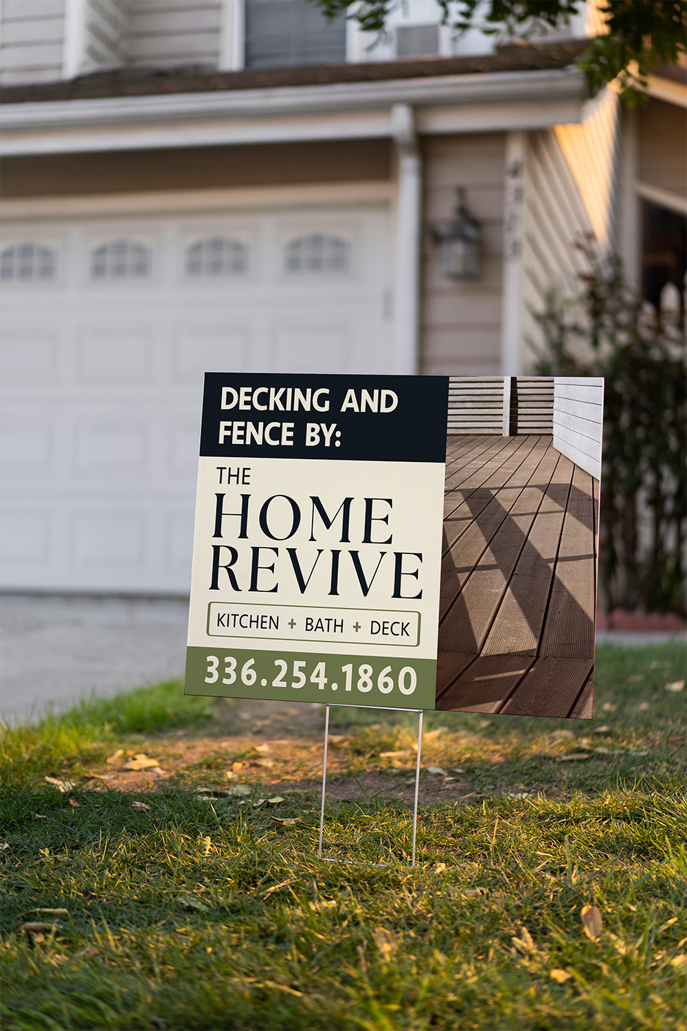
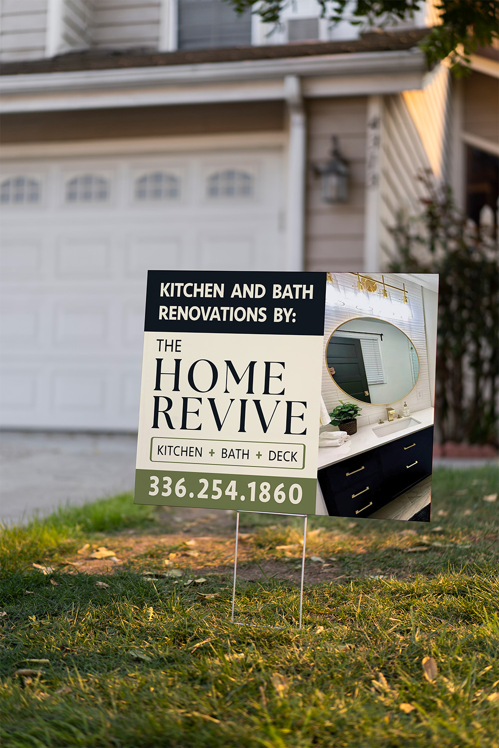
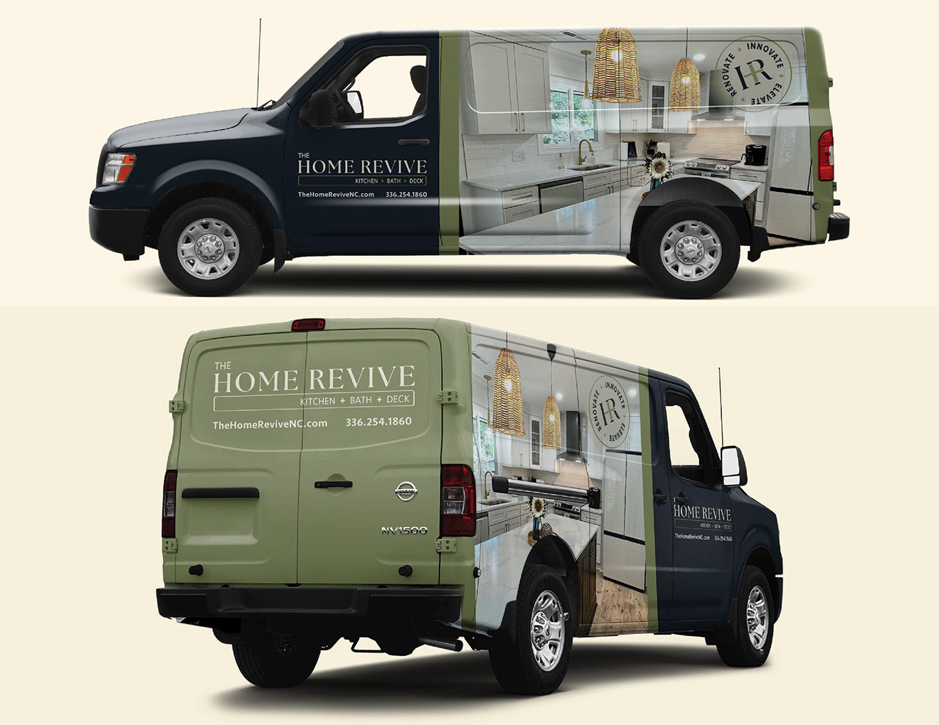
With a clear understanding of The Home Revive’s goals and values, we moved into crafting their brand identity and creating a cohesive landing page to introduce the new business. The visual style balances professionalism and warmth, with earthy tones and high-contrast elements that communicate trust, elegance, and approachability.
Bold, clean typography serves as a focal point of the brand identity, projecting confidence while remaining welcoming. The natural color palette—featuring tones like pale tan, dark charcoal, rejuvenating green, and terracotta accents—was chosen not only for its warmth but to evoke feelings of renewal and energy. The green, in particular, was selected to emphasize the “energize” and “revive” concept central to the brand.
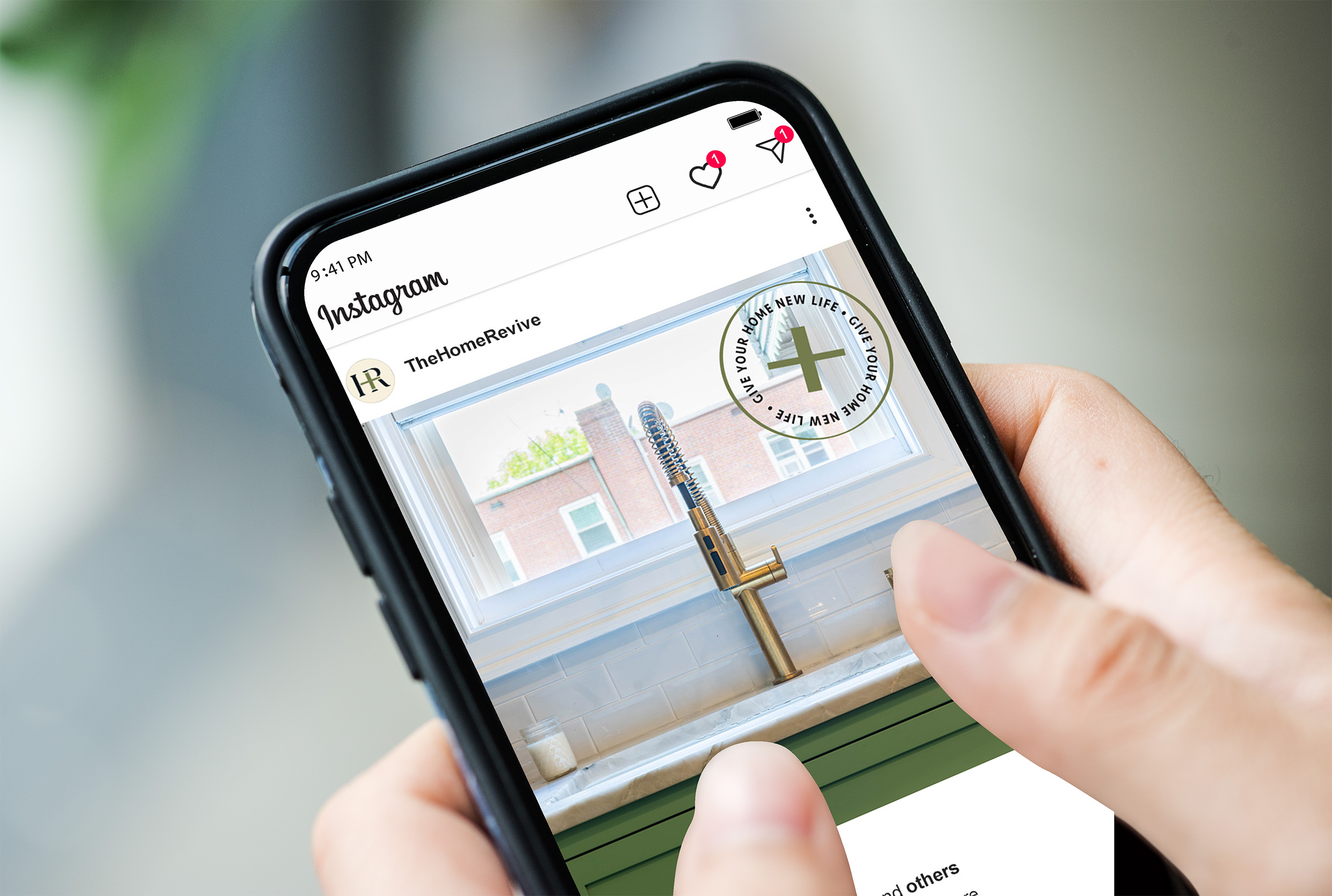
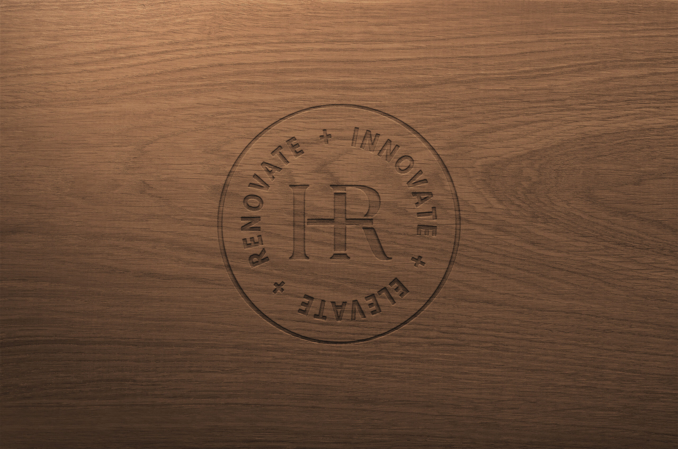
To further reinforce this theme, I incorporated a green plus sign into the identity design. This simple yet impactful icon subtly alludes to growth, transformation, and the positive impact The Home Revive brings to every project.
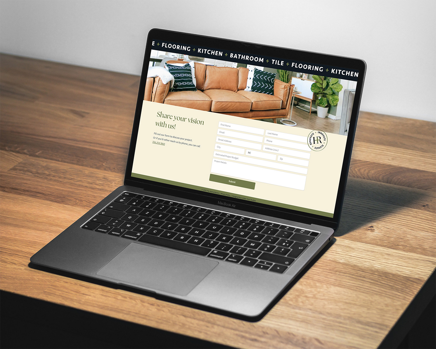
The landing page was designed as an inviting first touchpoint for potential clients. It highlights The Home Revive’s mission, values, and services, giving visitors a clear understanding of how the company can help with renovation projects that exceed typical DIY scope. The simple, user-friendly layout ensures easy navigation and builds trust through a polished and professional presentation.
Overall, these efforts provided The Home Revive with a strong, cohesive foundation to launch their new business and connect with their target audience effectively.