Fresh Reset is a one-woman commercial cleaning business focused on helping professional spaces feel refreshed and cared for. With a modern and approachable presence, the business offers deep cleans and routine upkeep tailored to each client’s needs. It’s a brand built on the belief that a clean space creates room for focus, calm, and forward momentum. Rooted in personal growth and quiet tribute, Fresh Reset is more than cleaning — it’s a fresh start.
Taylor Goehring knew she wanted to start a commercial cleaning business that honored a member of her family. At the beginning of her journey, she had no business name or brand identity — just a concept and a strong sense of purpose. She needed a clear, intentional logo that captured both the essence of her services and the deeper meaning behind them — something a DIY template wouldn’t be able to provide. This project challenged me to translate her vision into a brand that felt clean, approachable, and professional while honoring the heart at its center.
The Vision
The Vision
At the heart of this brand was a story — I knew it would be essential in making it feel not only professional, but purposeful. I’ve come to realize that in many service-based industries, people aren’t just investing in a product, but in the person behind it and the reason why. That’s why we rooted the brand in this fresh chapter of Taylor’s life, while also reflecting the clean reset she offers to her clients.
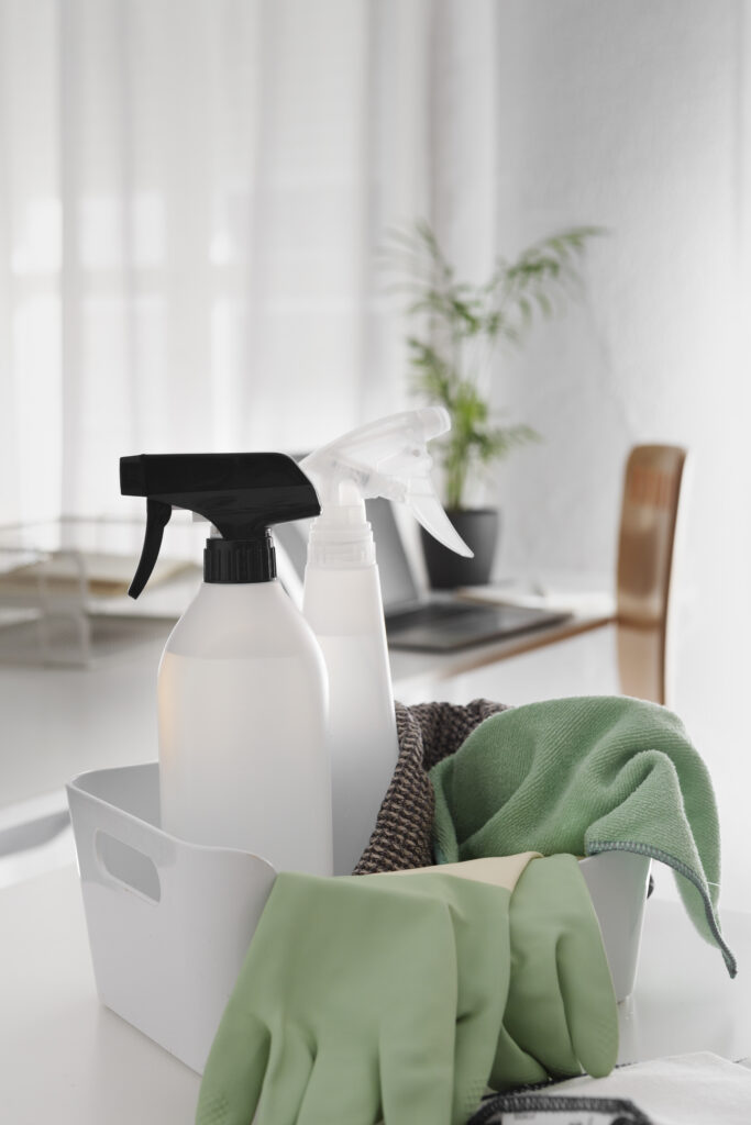
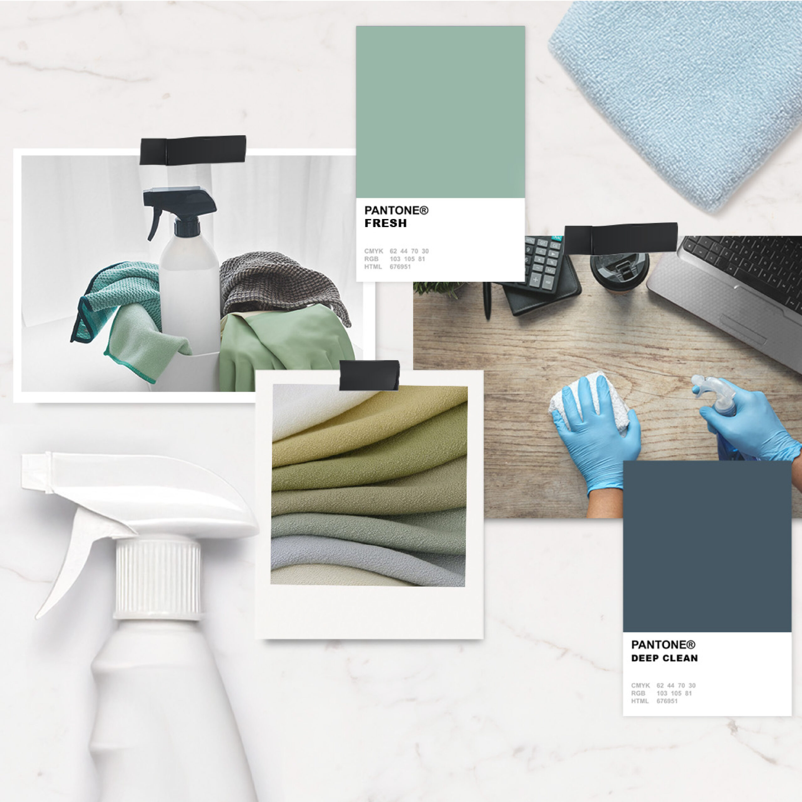
The visual identity was shaped with this in mind: a calm, neutral color palette evokes a refreshed feeling. The typography transitions from a loose, italic script to a grounded, bold serif — representing the shift from disorder to stability. Circular line elements reinforce the idea of a new day, a full-circle moment, and the rhythm of routine — all pointing back to the core idea of a true fresh reset.
The Results
The Results
Taylor was thrilled with the final brand — she felt the identity reflected her vision and has given her the confidence to move forward with clarity and credibility.
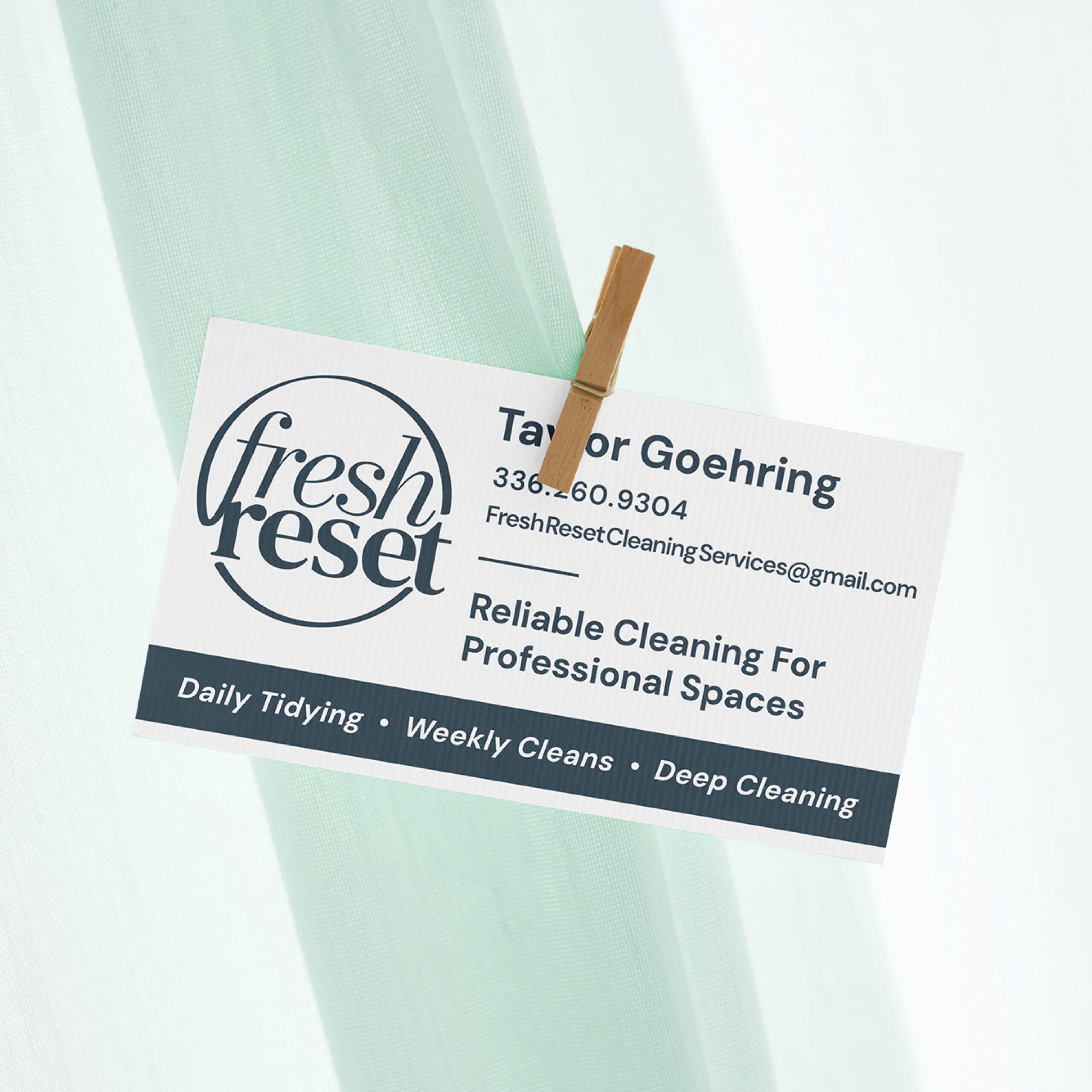
Along with the visual identity, I provided a custom business card design and tagline options to help shape her messaging. Some spoke directly to the service itself — like “Reliable cleaning for professional spaces” — while others subtly honored her family name (Strider) with lines like “Refreshed spaces, taken in stride.” While there aren’t hard metrics yet, the brand gave Taylor a strong, meaningful foundation to build from.
For me, this project also sparked the creation of a new mini brand package — a streamlined offer designed for clients like Taylor, who are just getting started but want to start strong.


